Intro
United Insights is a collaboration workspace for Credit Suisse. It's an internal collaboration system for people who work on Politically Exposed Person (PEP) review, requiring the compliance officers to work closely in a cross-functional team with colleagues from different sections, i.e. legal, relationship management...etc.
I worked as the led designer with 2 Cornell students, partnering with Credit Suisse on this 3-month design project. The final outcome is an interactive high-fidelity prototype on Invision, which received great feedback from the stakeholders.
Exisiting wireframe from internal design team
When the project started, the client already have a mid-fidelity wireframe that was created by the internal design team and want us to base our design on it. However, after reviewing the wireframe, we believe there are some potential pain points and conduct user testing with 10 people to validate our assumptions.

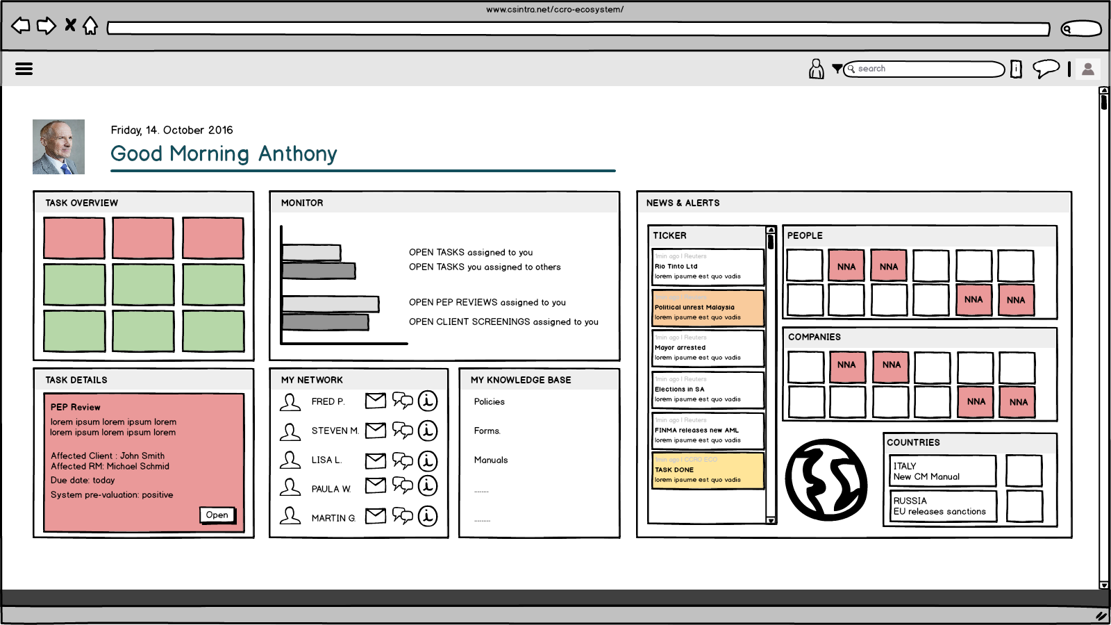
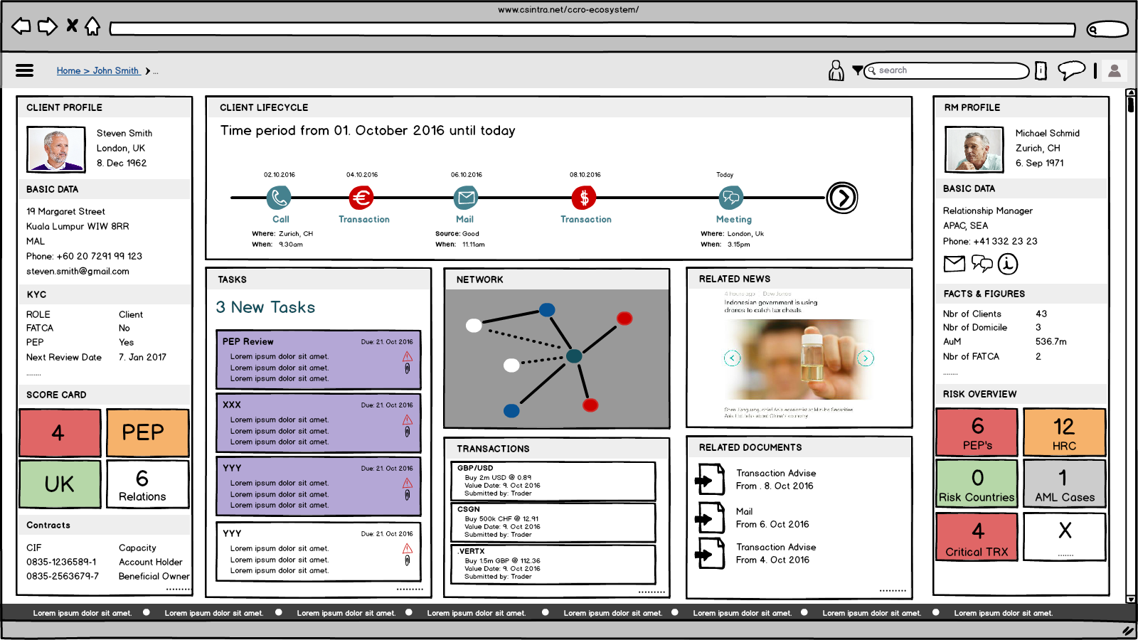

Initial wireframes created by the internal team
Time to test it out!
We showed the mid-fidelity wireframes to 10 participants separately and asked them to complete a list of tasks that a compliance officer would perform frequently:
1. Find what tasks are due today
2. Find the most recent transaction in task E
3. Find the phone number of the client in task B
4. Find the most recent activity with a client in task A
5. Find the chatting area with your collaborators in task A
2. Find the most recent transaction in task E
3. Find the phone number of the client in task B
4. Find the most recent activity with a client in task A
5. Find the chatting area with your collaborators in task A
We collected and analyzed participants' responses, and ranked them according to the severity level:
8 out of 10 users failed to find the chatting area with collaborators in a task. I marked this problem as catastrophic because allowing collaborators to communicate effectively and efficiently is the major goal of this internal collaboration workspace.
In addition, 5 users were confused by the navigation. The feedback of clicking on a certain task is so insignificant that users were not sure if they successfully conducted an operation. They thought that they should be brought directly into the detail page, instead of seeing different content in the task details box. I marked this system visibility problem as critical because it would hinder the users to find essential task details.
It's clear that the current wireframe has lots of gaps between the product's conceptual model and the user's mental model, causing confusion to users. This research was strong evidence that we should not design based on this wireframe and the clients agreed when they saw our findings.
New Start: Persona and User Journey
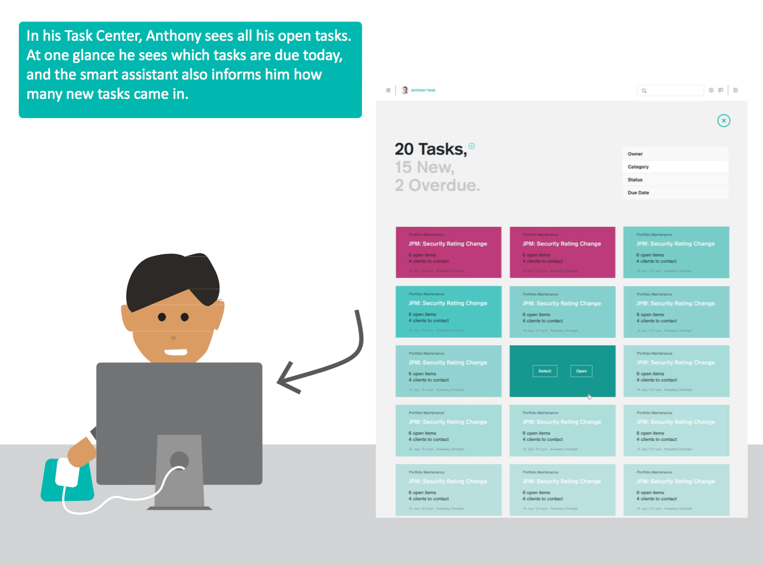
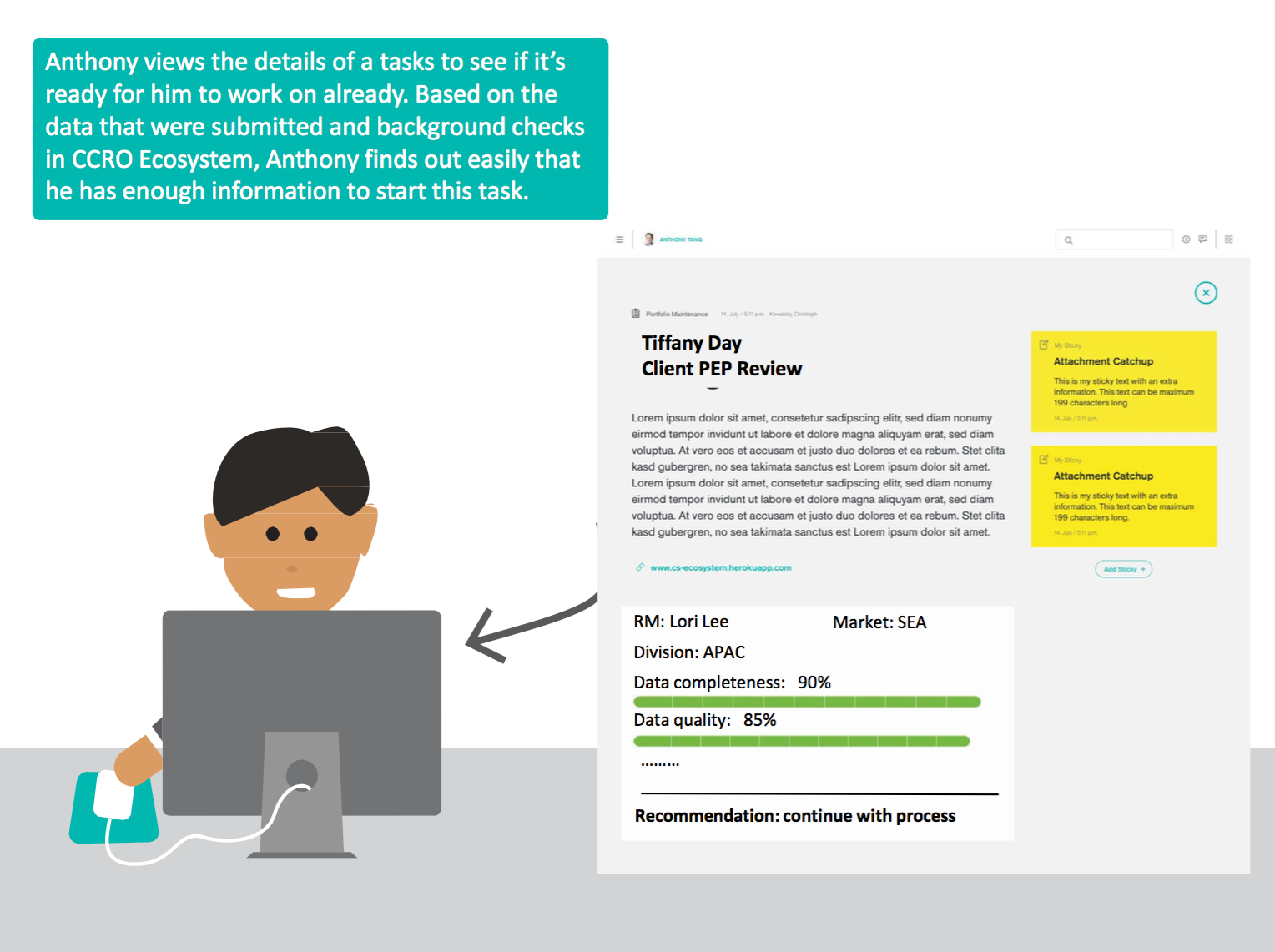
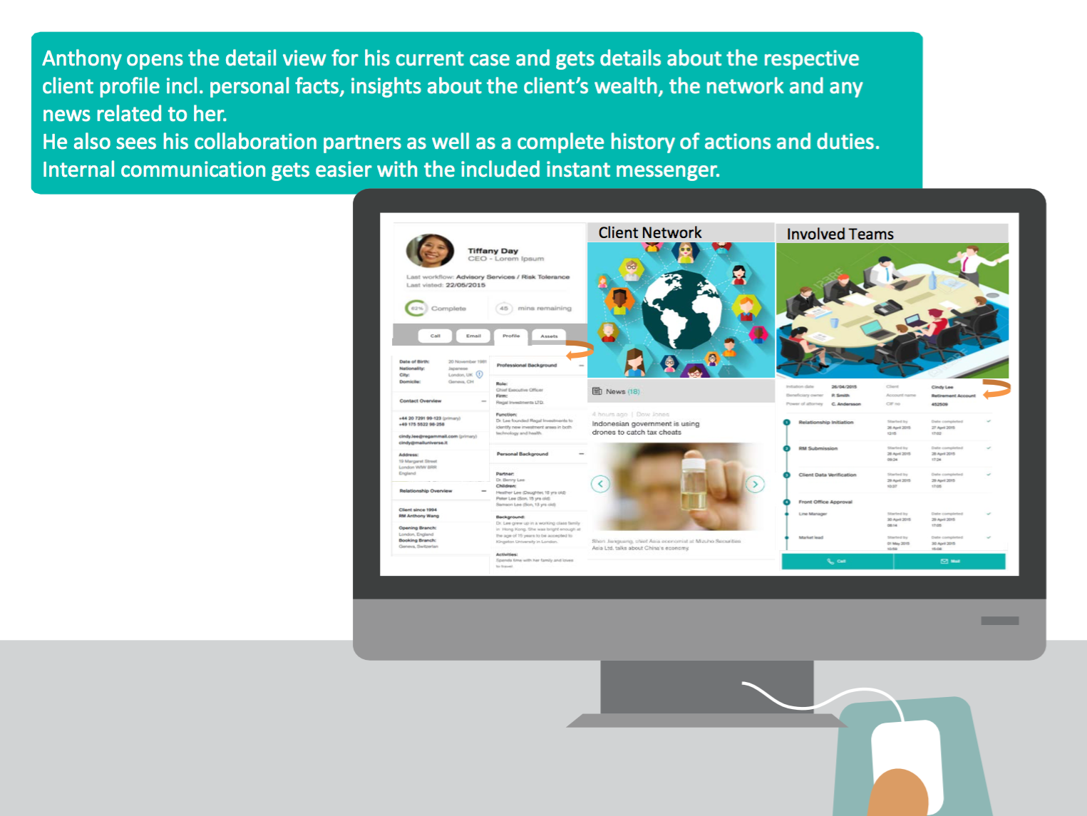
To better emphasize with our users and understand their daily tasks, I created a persona named Anthony, who's a compliance officer in Credit Suisse. The below graphs describe his daily tasks and key user goals, including PEP reviews and onboarding new clients:
"How might we present the complicated tasks clearly and make the cross-functional collaboration efficient for Anthony?"
I've identified 5 key features that would help Anthony to achieve his goals:
1. A task overview page showing recently due and new coming tasks
2. A task detail page to check its progress
3. A detailed visualization of the client's background information to review
4. A collaboration dashboard showing the activities of other collaborators
5. An instant messenger to communicate with collaborators internally
2. A task detail page to check its progress
3. A detailed visualization of the client's background information to review
4. A collaboration dashboard showing the activities of other collaborators
5. An instant messenger to communicate with collaborators internally
With these in mind, I followed the design thinking process and iterated the design several times. The final prototype was delivered on Invision with the design specs & assets available for future development.
Design highlights
Project Overview Card
The project overview area is the first thing that will catch user attention for a considerable amount of time, according to the F-shaped eye movement pattern of reading websites. Also, this area will contain the most important information for achieving user goals - the projects. Thus, I enlarge the size of this area to indicate its importance. Before, the task detail preview and the task overview were two separate areas on the landing page. Thus, it's hard for users to see the relationship between them, especially when they were clicking on different tasks. Therefore, I redesigned the task overview area as a collapsible menu. When the user clicks on a certain task title, the preview detail will expand and show the information related to this task.
Make collaboration area more accessible
The collaboration area was hidden in the client cycle on the task detail page. It takes at least five steps for users to communicate with their collaborators if they could find the way. I redesigned the collaboration area and make it directly visible on the project detail page. Furthermore, in order to guide users from the landing page, I put the basic information of collaborators in the task preview. When users click on any task on the landing page, they can see the photos and names in the preview. And if they want to have further interaction with them, they would intend to click on the detail page.
The collaboration area was hidden in the client cycle on the task detail page. It takes at least five steps for users to communicate with their collaborators if they could find the way. I redesigned the collaboration area and make it directly visible on the project detail page. Furthermore, in order to guide users from the landing page, I put the basic information of collaborators in the task preview. When users click on any task on the landing page, they can see the photos and names in the preview. And if they want to have further interaction with them, they would intend to click on the detail page.
Integrate Network & Related News
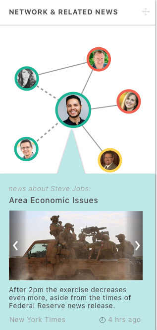
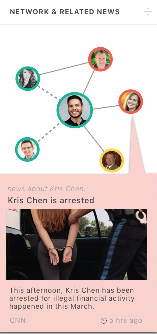
In PEP review, it's important to check the client's interpersonal network and to know things about them. Before, the network and the related news were two separate areas on this page. Thus, it's hard for users to see the relationship between them, especially when they were clicking on different people. That is, the visual feedback is not enough. I integrate these two areas into one. By default, it shows the related news of the client. When users click on a different person in the network, the box of related news will change accordingly. The color is related to the degree of danger of the person, using the classic Red-Amber-Green color theme. There's instant feedback for users to see what they have done and how the system reacts.
In PEP review, it's important to check the client's interpersonal network and to know things about them. Before, the network and the related news were two separate areas on this page. Thus, it's hard for users to see the relationship between them, especially when they were clicking on different people. That is, the visual feedback is not enough. I integrate these two areas into one. By default, it shows the related news of the client. When users click on a different person in the network, the box of related news will change accordingly. The color is related to the degree of danger of the person, using the classic Red-Amber-Green color theme. There's instant feedback for users to see what they have done and how the system reacts.
Customizable Card Layout
On each card or block, there is a movable handle that allows the users to drag and customize the layout as they prefer. Because this product is a system to facilitate cross-functional team collaboration, it is essential to consider and respect that every team has its own working style. Most of all, people in different positions would give priority to different information. Thus, allowing everyone to adjust the layout is beneficial for the users and for completing the tasks.
Feedbacks
I presented the final design prototype to Credit Sussie stakeholders and received very positive feedback. One compliance leader stated that this is very intuitive and she could imagine this would improve their productivity greatly. "I wish we can have it right now." The clients see great potential in this design to move into development. The Invision prototype is a hand-off to the client with all the design specs and assets available.
Thank you for your time reading this article. Hope you enjoy it!

