Overview
I was the lead designer of this financial goal-based planning tool for one of the largest investment banks in the world, from research to release. In this 15-month project, I collaborated with the stakeholders, project manager, engineers, and researchers in an agile project framework. This responsive website aims to engage users by helping them plan and achieve their financial goals, including retirement, education savings, pay off debts...etc. The product was rolled out to 36 companies with 60K+ potential users. To date, it has a 15.4% conversion rate in converting prospects into clients.
Project Goal
Money is stressful, and planning could be intimidating, but it's never too late to start today. That's where this product could help. The project goal is to create a lightweight, re-useable, digital goals-based planning experience that enables prospects to better understand their financial situation as they explore their goals; and present the appropriate channels for further guidance, with the objective of converting prospects to clients. The success metric is the conversion rate. From a high level, there are 3 major phases in this experience: landing, discovering, and engaging.
High-level User Flow Diagram
My Design Process
Discover: understand the problem
As a UX designer, I started by thinking of what problem are we solving for users: how might we help users identify their goals, understand their current situation, and help them achieve thru a lightweight experience that the firm doesn't currently provide. If you want to plan with the firm, you will have to be a client first.
I gathered information about the competition in order to forecast the potential for the market, i.e. Betterment, Mints, Fidelity...etc. I also looked into the ones outside of the financial area like Productive, iOS Activity, MyFitnessPal, which are helping users to achieve their life goals. I focus on how these products help users to assess where they are comparing to the goal and how to motivate them to continue engaging with the app/website.
I gathered information about the competition in order to forecast the potential for the market, i.e. Betterment, Mints, Fidelity...etc. I also looked into the ones outside of the financial area like Productive, iOS Activity, MyFitnessPal, which are helping users to achieve their life goals. I focus on how these products help users to assess where they are comparing to the goal and how to motivate them to continue engaging with the app/website.
Some examples of goal-based planning experience
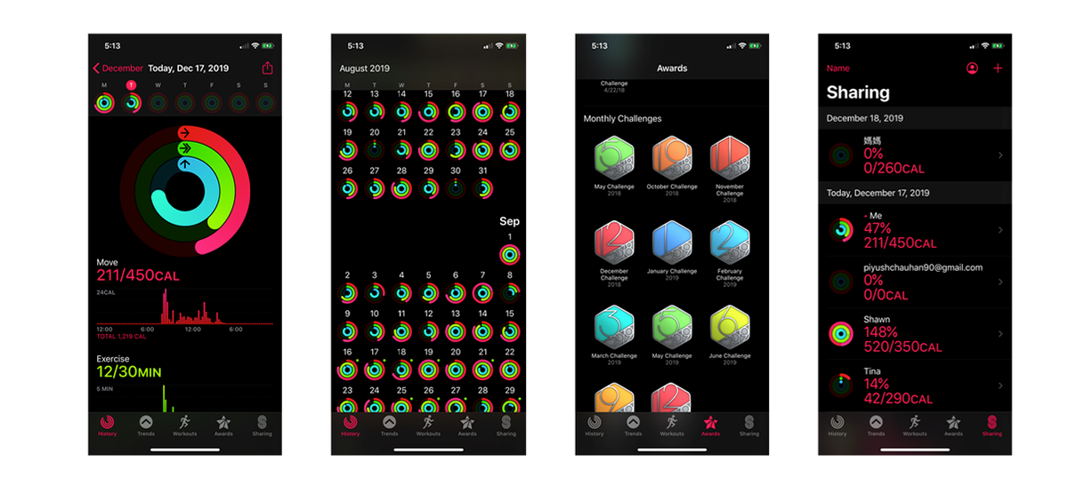
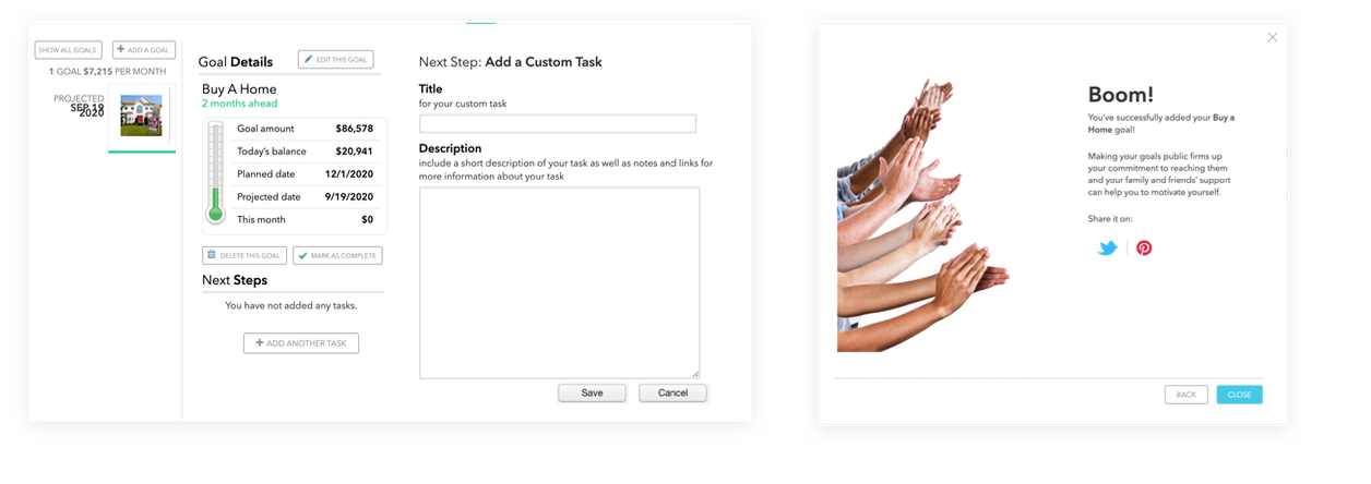
As a psychology major, I also want to approach the design from a behavior science perspective: what ticks us to do a certain thing, like save $10? The Fogg's model states that it's a combination of triggers, motivation, and ability. But what makes us do it over and over again, i.e. save $10 every day? The Hooked model thinks people are continually engaged because they have been asked to invest the right amount of effort into the product.
To summarize what I've observed in the competitor analysis and the behavior models, I put together 6 design recommendations for creating a successful user-centered, goal-based experience. Not all points got implemented in the final design due to scope change and other constraints, but they are a good starting point to have the whole team thinking from the users' perspective.
Define: Personas & User Journey
This tool exists on the co-branding employee benefits website if one's employer is collaborating with the investment firm. One will also receive an email from the employer regarding this tool, as a touchpoint to this planning tool.
The senior or wealthier people are most likely already engaging with financial planning/advisory services. Our target users are those who are in the early-mid stage of financial growth. We not only want to help the people who are younger and hopeful; we also want to help the middle-ages who are stressed by money and were too intimidated to engage with an advisory service. By involving the stakeholders, two personas are developed based on the research that was previously done by the firm's research team: Jen and Bob. They affected the design by reminding me that I need to think more holistically -- it should be rewarding for Jen and assuring & supportive for Bob at the same time.
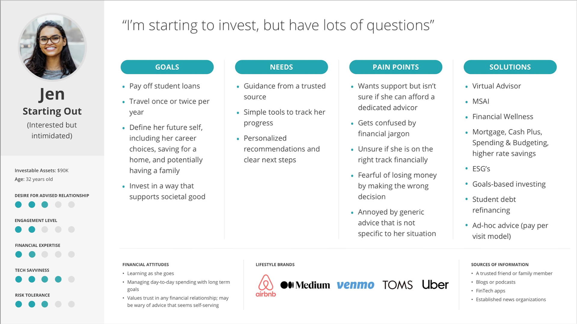
Persona #1: Jen
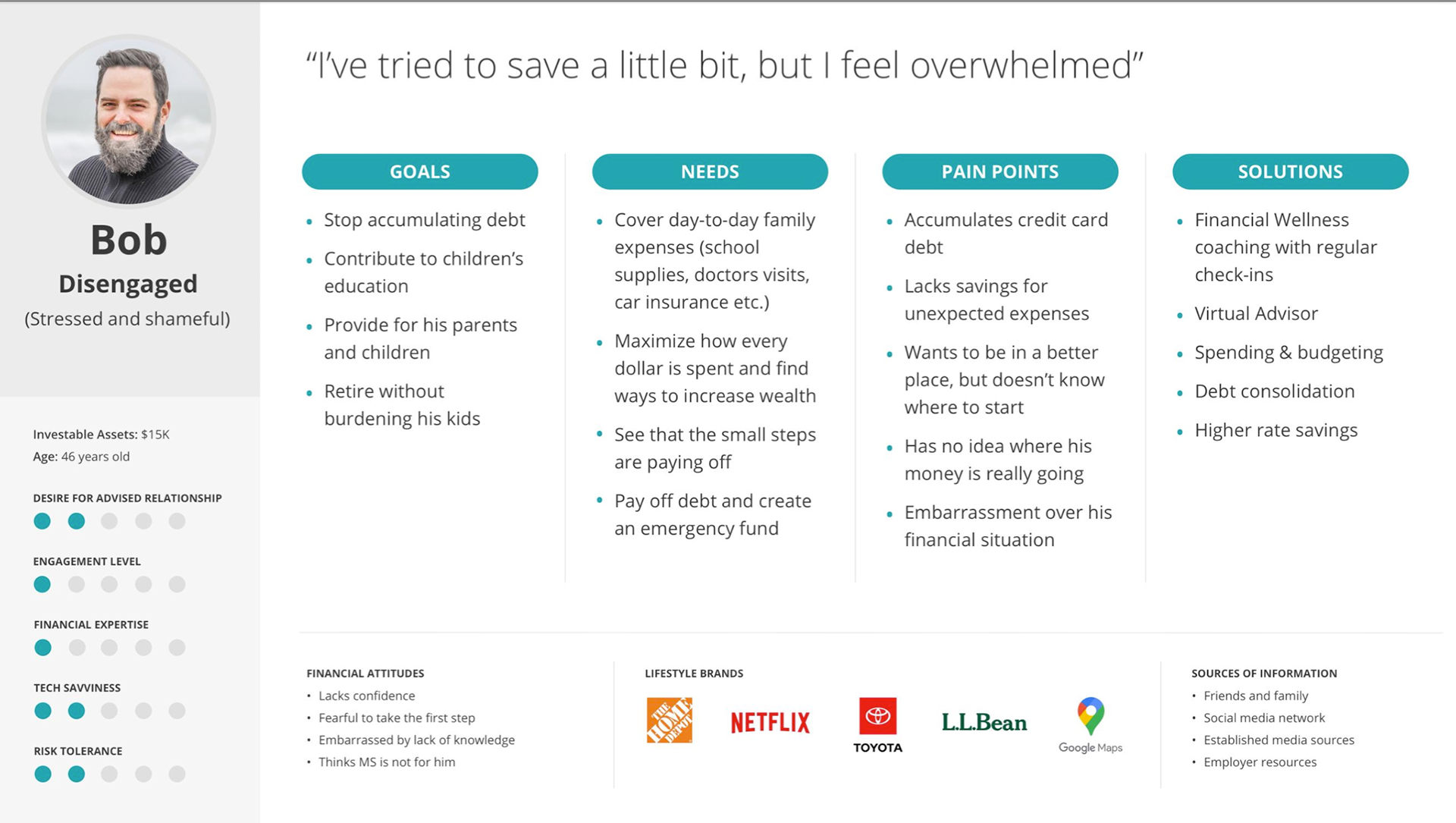
Persona #2: Bob
Based on the persona, I continued to map out the user journey with the stakeholders and subject experts. This journey helps me to better understand and visualize what the persona might be going thru in every stage of interacting with a goal-based planning product -- what are the potential pain points, opportunities, and emotions.
Focus the lens: Plan for Retirement
This goal-based planning tool is a re-usable framework built on Adobe Experience Manager (AEM) that can be quickly applied for different user goals, i.e. pay off debt, college funds, emergency saving..etc. For MVP, the stakeholders decided to focus the scope on retirement readiness assessment first -- help users figure out how ready they are for retirement and engage with the firm to achieve that goal. According to the National Retirement Risk Index (NRRI), which pre-pandemic said that 50% of households are in danger of lacking sufficient funds to continue their standard of living once they stop working. After coronavirus-induced months of economic misery, that number has jumped to 55%.
Ideate: Sketch & Wireframes
At the beginning of my design process, I created wireframes to review with the stakeholders, tech lead, and peer UXers. Below are some of the explorations on the questions & result pages. The idea is to make the whole experience conversational and approachable. Almost like you are talking to a person. On question pages, I visualize the process by adding a stepper on top and provide helpful information in a link. On the result page, I show the result with some data visualization to help users better understand their retirement readiness.
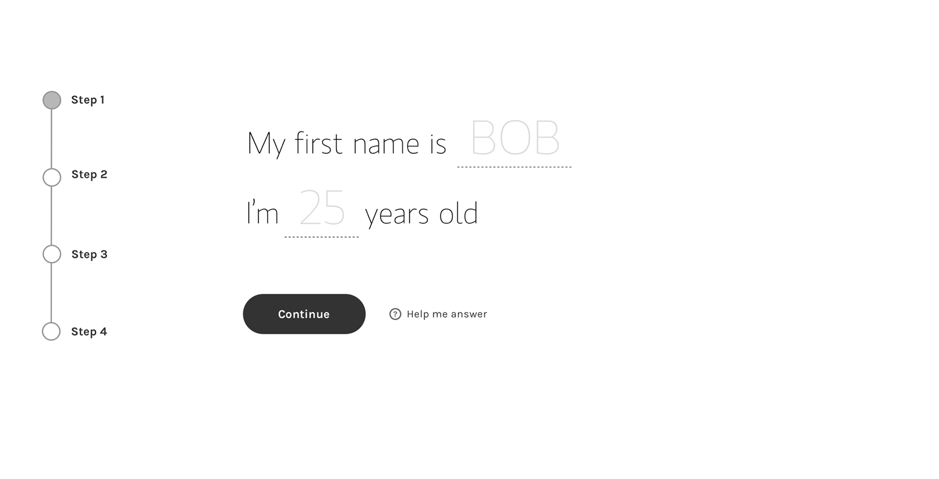
Wireframes - Question page
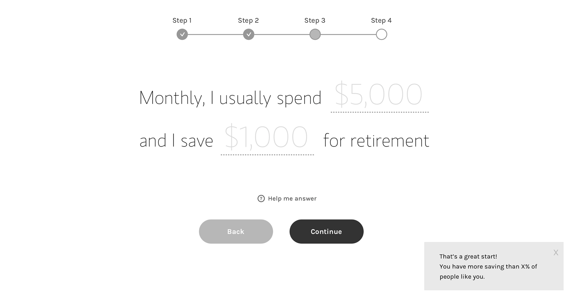
Wireframes - Question page
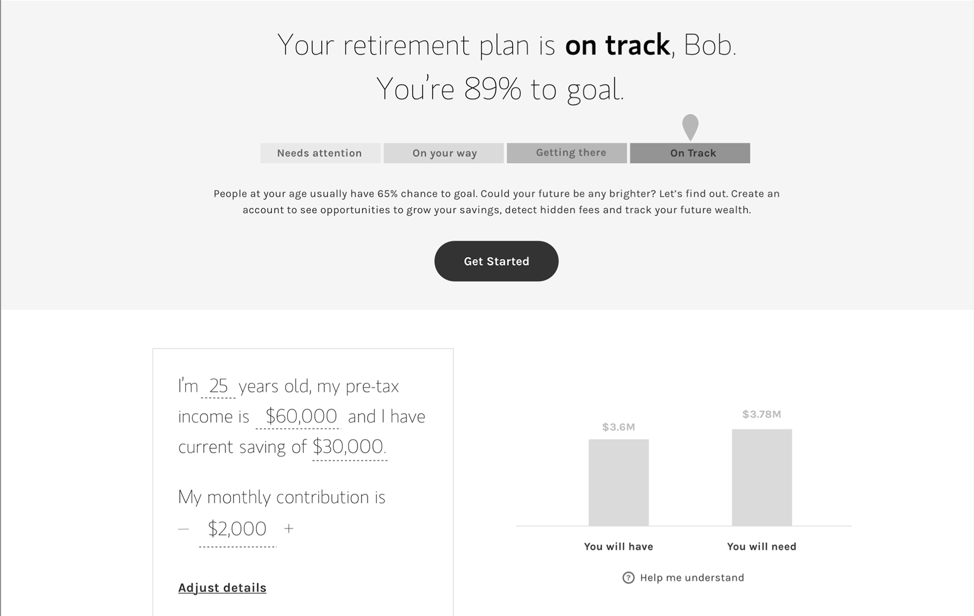
Wireframes - Result page
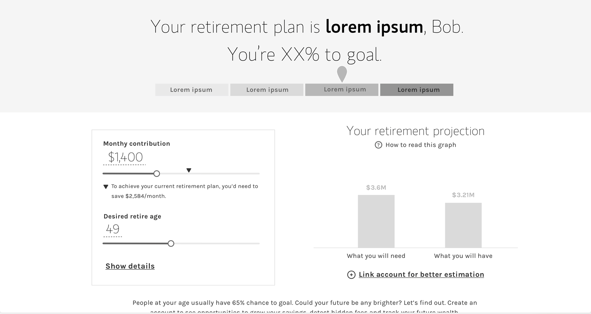
Wireframes - Result page
Prototype: Refine content and IA
The firm has a UI design library with built components that are ready for usage. However, the free-form input UI is only allowing 1 input per page. While it's clean, I believe the screen can be better utilized by providing helpful information or stacking 2-3 input fields on a single page. On top of it, I also found that some users don't think the input field is where they could click and enter info. It also has accessibility issues with keyboard users. The UX team agrees with me so I also take on the task of re-designing the input field in the design library.
Challenge 1: What questions to ask?
Finance is stressful for a lot of people and the assessment result might be not so great for some users, especially for the "Bob" persona type. How to make this assessment delightful, welcoming, and engaging is crucial.
I focus first on making the experience low-effort and stress-free. To reduce the user's time & effort, the assessment should only ask for the few required questions that are needed to generate a good result. The first challenge for me is -- what questions to ask and how to help users better answer them? There's apparently a trade-off between the number of questions asked and the result accuracy. In the competitor analysis, the number of questions ranges from 18 to 2. Some will take you 30 mins but some only ask for your name and DOB. Asking too many questions could be tedious while asking too few could discredit the result and feel sketchy.
To find the right balance, I worked with the stakeholders and business team to figure out what data points we will need from users. What we came up with is to pull statistical averages from the database for some of the data points that could be represented well. For example, the US life expectancy is around 95 years. Most retired people spend 70% of their pre-retirement monthly income. We use these assumptions on top of user inputs to calculate a satisfactory result. After viewing the result, users should be able to adjust the assumptions if they desired. We narrowed the questions down to 5 questions.
In addition to the questions, I also want to put on information about "Why are we asking this?" or "How will this be used?" to help users understand the question better and to encourage them to answer.
Challenge 2: How to ask for asset information?
To understand the users' financial situation holistically, I will need to collect their current asset information: how much savings do you have? Do you have a retirement account? is it 401(k), IRA, or Roth IRA? For users who have multiple accounts, it could be a lot of works to enter it manually.
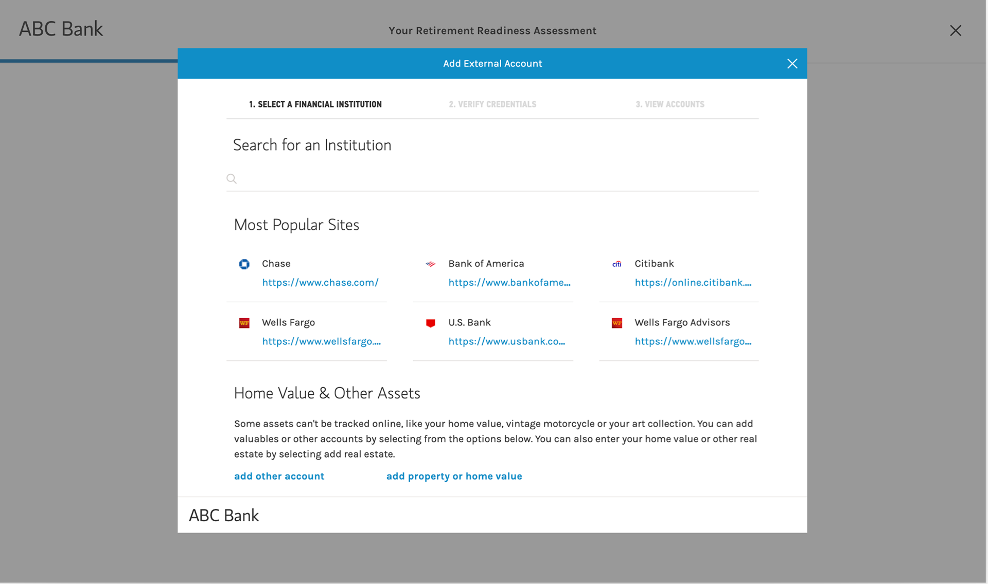
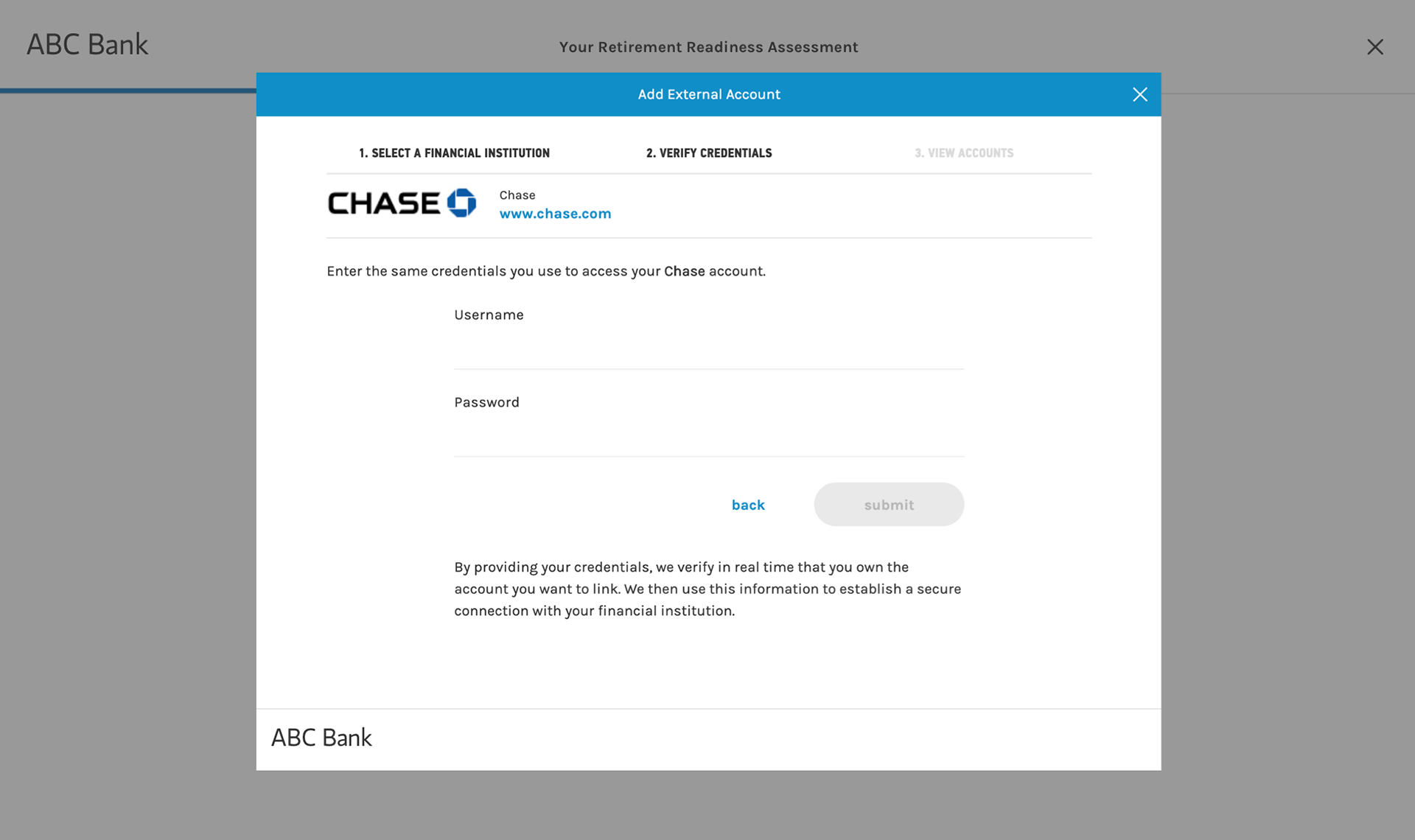
A more efficient way would be to help users link their external accounts so the system can import the numbers automatically. However, there are underlying privacy concerns with providing all your account credentials. Would users be comfortable with that?
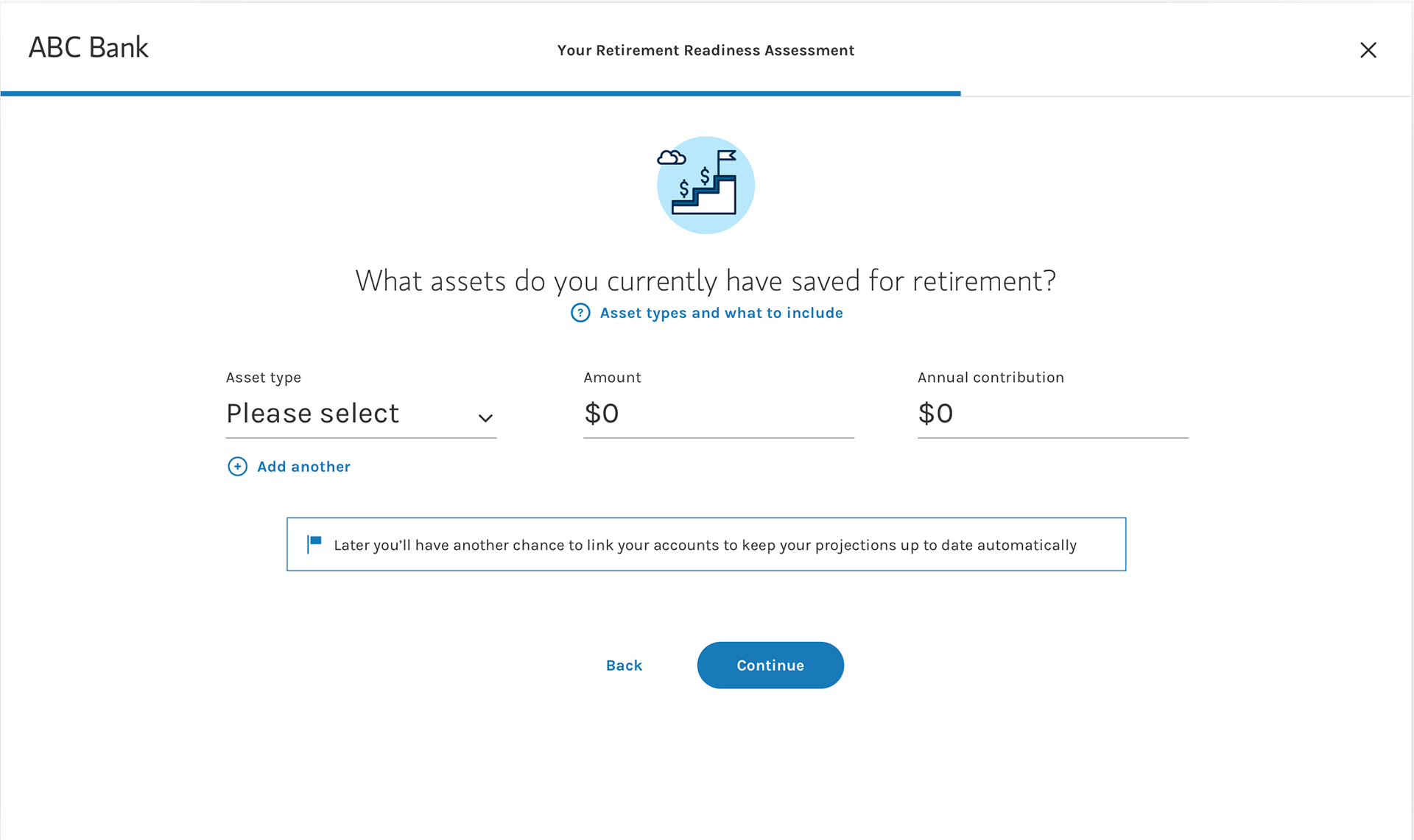
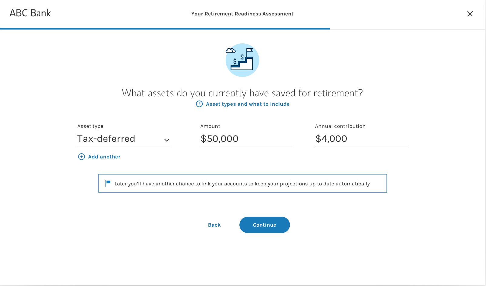
To hear from the real users, I created 2 high-fidelity prototypes and worked with the researcher to conduct A/B testing:
A) Manually enter asset information
B) Link external accounts
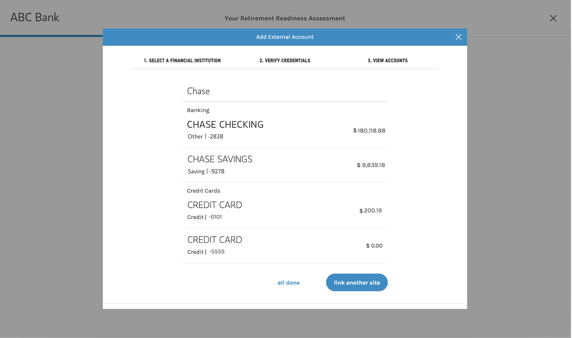
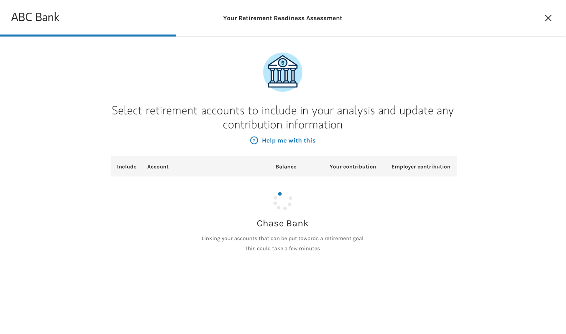
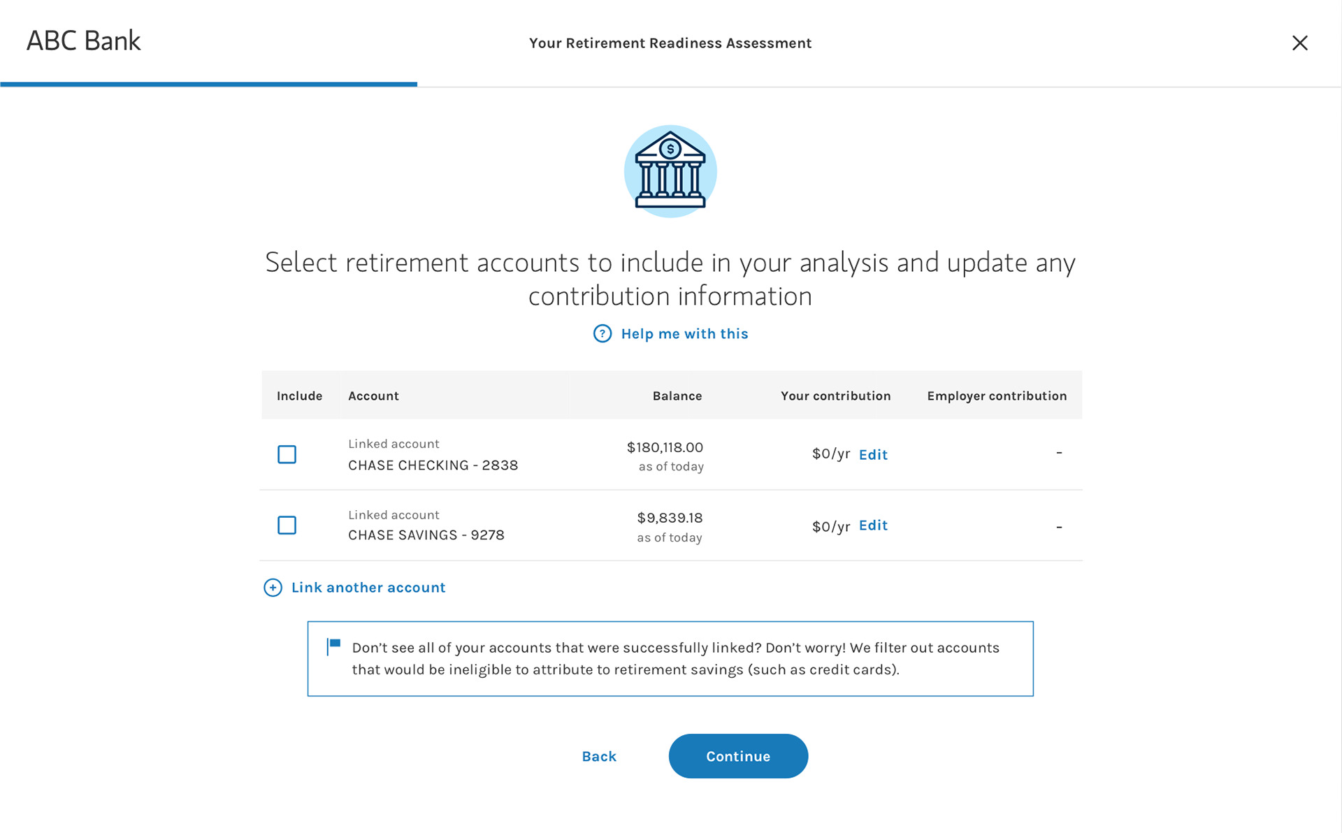
Test: Hear from the users
I worked with the researchers to develop the testing scripts for both moderated and unmoderated sessions. We recruited 40 participants to explore what users expected and how they reacted to the experience, aiming to uncover users' attitudes towards providing their asset information either by manually entering or by linking accounts.
Research Methodology:
Participants: 40 UserTesting.com participants
Age: 30-45 (20/40), 45-60 (20/40)
Income: 60K-99K (11/40), 100K-149K (23/40), 150K-200K (6/40)
Investable Assets: 50K+
Sessions: Unmoderated (32/40) + Moderated (8/40)
Key findings
1. 70% of participants want to provide their asset information: 80% in flow A (manual input), 60% in flow B (linking account). Participants are slightly more willing to provide asset information by manual entering. Notably, participants with incomes ranging from 100K-149K were slightly more likely to link accounts than participants in higher and lower-income ranges. Surprisingly, we can't draw a statistically causal relationship between age and the willingness to link accounts.
2. 4 participants are strongly averse to linking accounts when prompted. Generally, these participants were averse to linking their accounts because they were concerned their information was not properly protected and/or did not feel the benefits outweighed the costs.
"I chose not to link. I am reluctant to release all my financial information to one company. But, over time, as I learn more about them and can see the benefit, I'm more likelyto go back later and link."
"I chose not to link. I am reluctant to release all my financial information to one company. But, over time, as I learn more about them and can see the benefit, I'm more likelyto go back later and link."
3. Participants expected the assessment to be longer and a bit more in-depth. They (in the moderated sessions expected that the assessment would ask them a multitude of questions about their current assets, expected age of retirement, and expected lifestyle in retirement.
"I expect it to ask me about lifestyle questions, do you want your lifestyle to be the same [in retirement]?"
4. Participants responded positively to signs of feedbacks. Across the entire flow, many users tended to comment on information that provided them with further explanation or feedback.
5. Participates are content with the level of information provided on the result page.
Iterate based on insights
The testing provides great insights into what users are thinking. We found that users slightly prefer manual entering over linking accounts due to security concerns. However, the efficiency and accuracy of linking accounts are also mentioned by 12 in 20 users. But who says has to be one way or the other? I want to give users the freedom to choose -- link accounts or manually enter.
We also found that some users actually want to be asked more questions because they want to provide more information (other than their bank credentials). That's a surprise to me cause I was focusing on asking the right amount of questions. Since it's not statistically significant, I want to further emphasize the fact that assumptions are used to deliver the results, instead of adding more questions.
Deliver: Final Design
After few more iterations, the final design is a responsive website that works on desktop, tablet, and mobile. It's built with the AEM (Adobe Experience Manager) as a template so it's easily reusable for future assessment-like products. I continued to provide in-sprint support to the agile squad and worked with the development, QA team to update the site when needed.
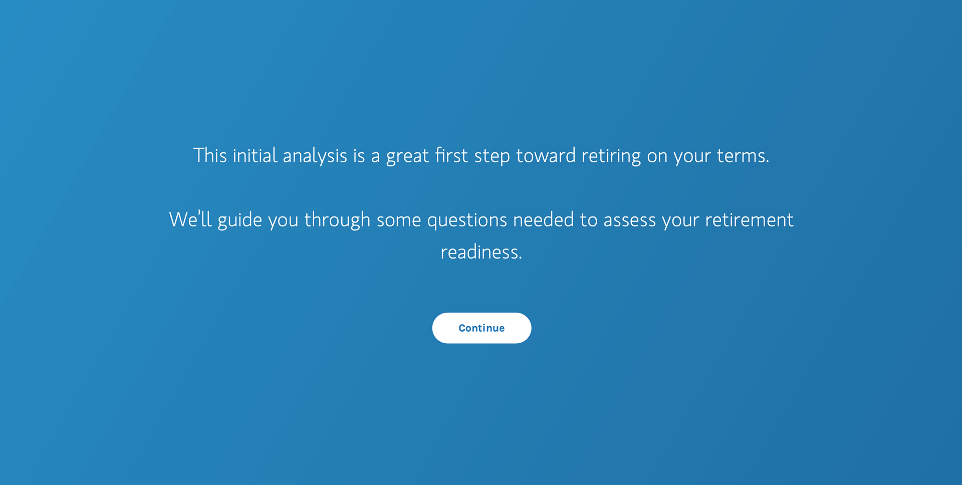
Welcome page
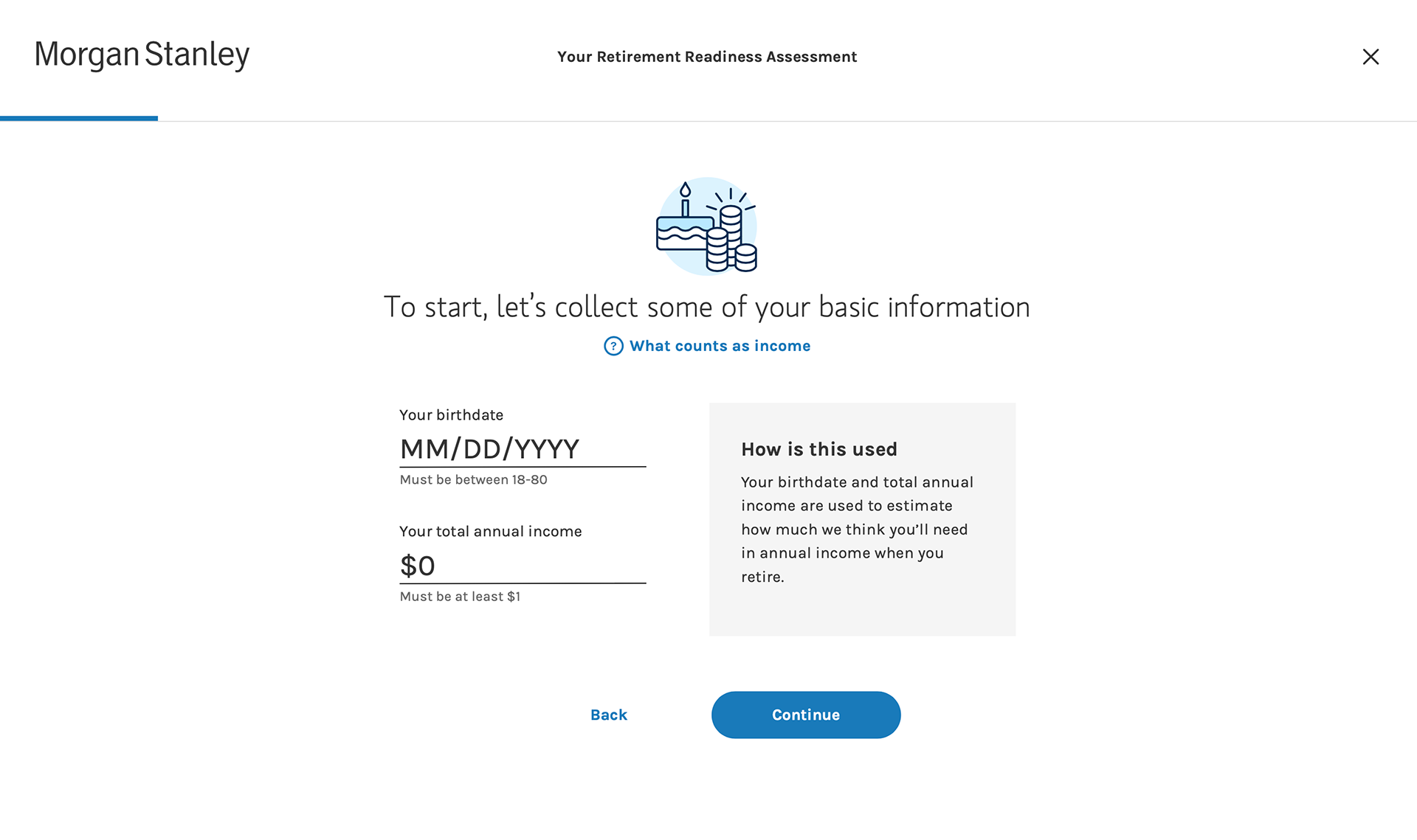
Name & DOB
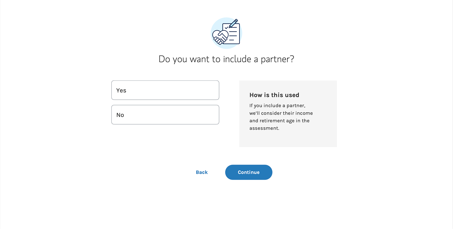
Partner
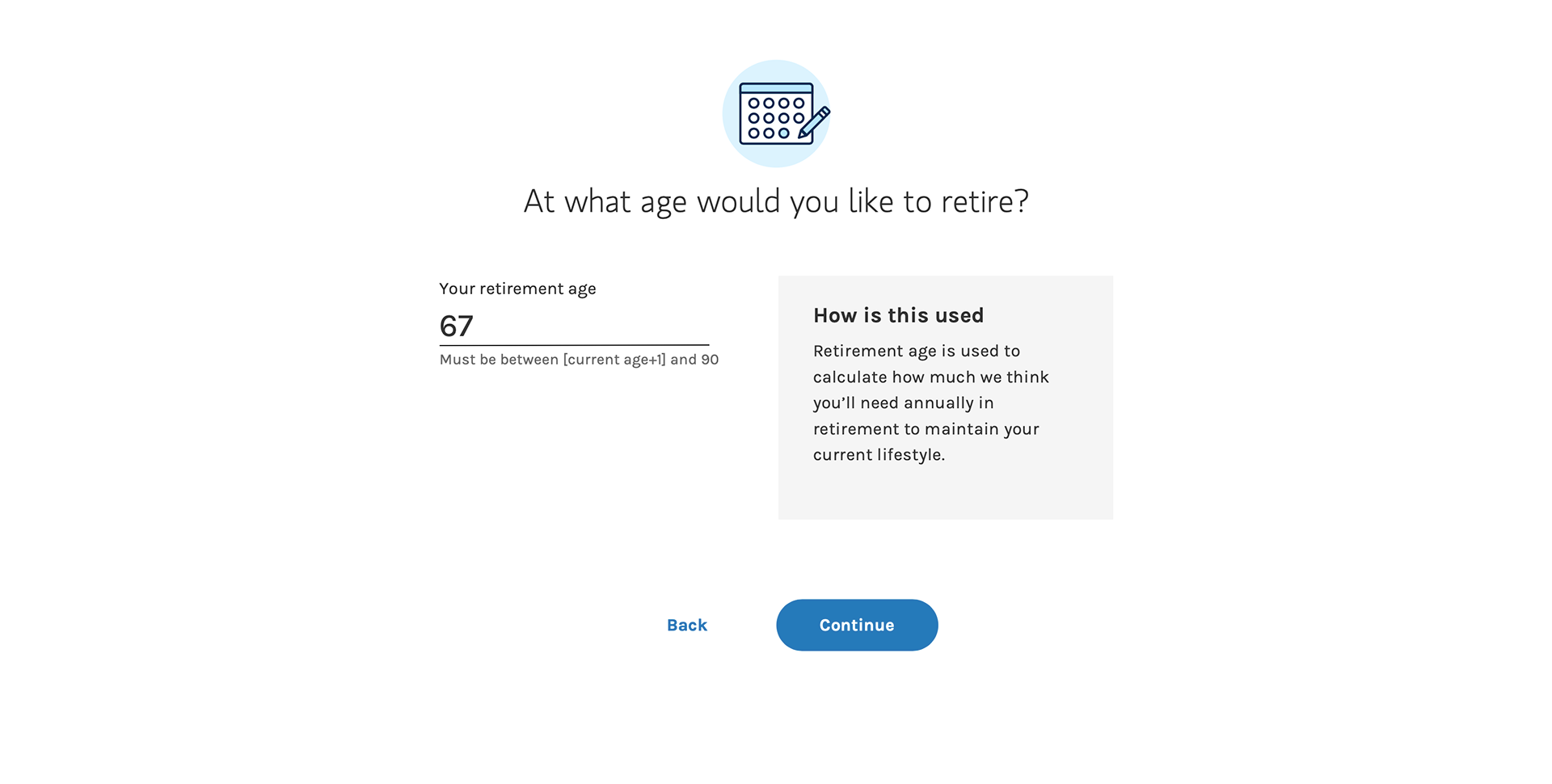
Age to retire
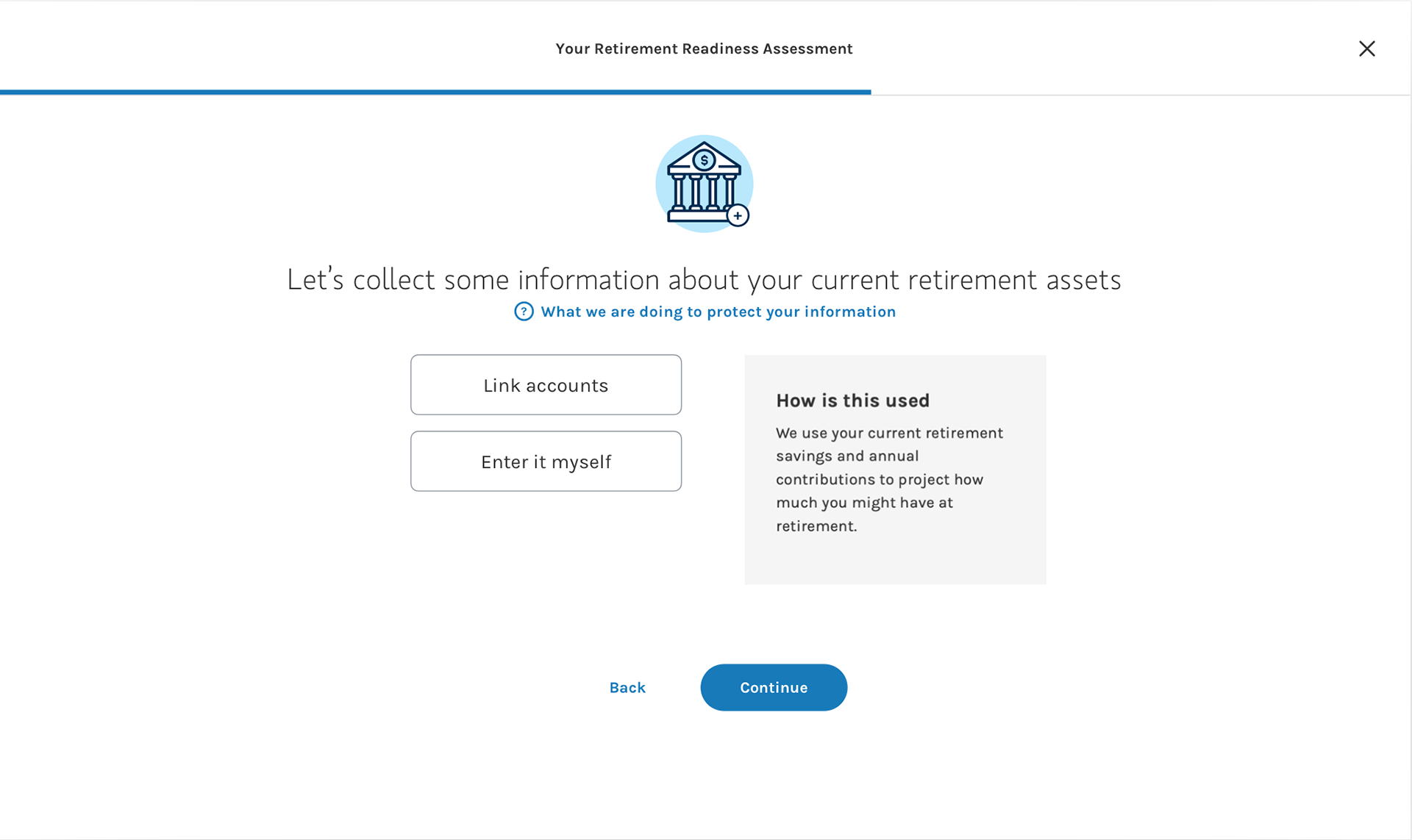
Asset information

Manual enter

Linked accounts
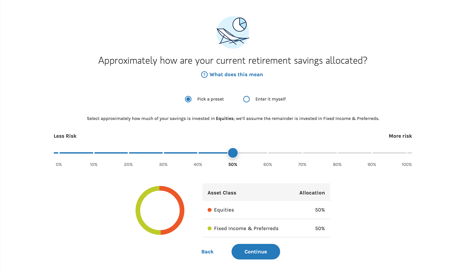
Asset Allocation - slider
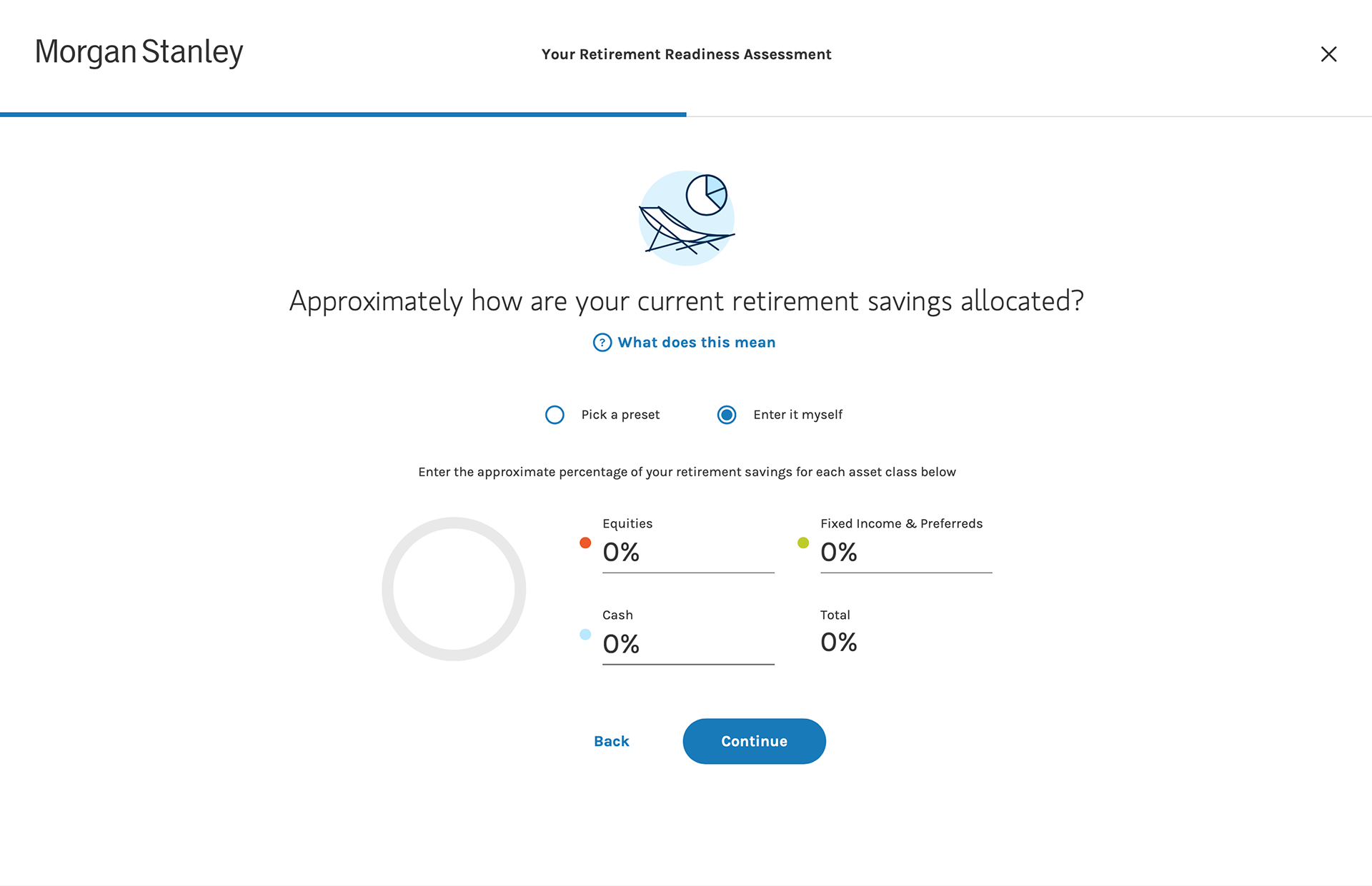
Asset Allocation - Enter it myself
⬆️ Questions asked in the assessment.
⬆️ The result page at the end of the assessment.
⬆️Detailed design specs with annotation delivered to engineers
The responsive website was released in Sep 2020. Clients provide positive feedbacks on the overall experience. Until today, the product is rolled out to 36 companies with 60K+ potential users and the number is growing. We observe a 15.4% conversion rate in successfully engage users with the firm.
Post-release Update
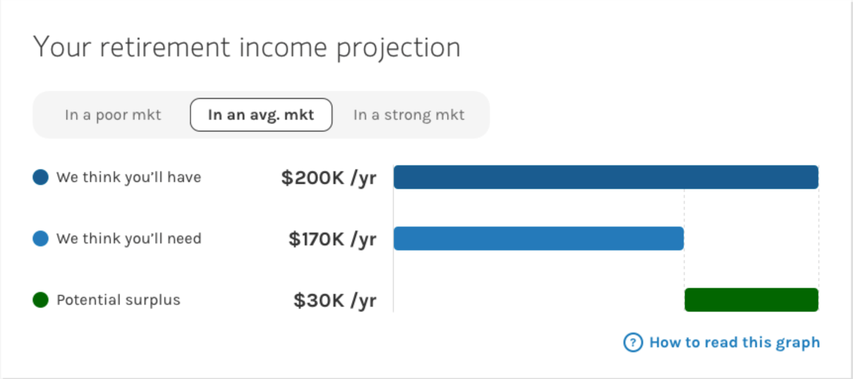
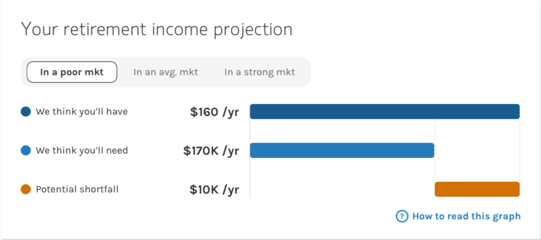
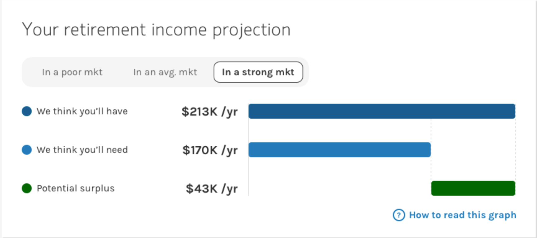
I continue to provide design support and release updates to further refine the experience. For example, on the result page, I want to show users that the projection might be different depends on how the market performs. This is also a feedback we heard from users. A toggle was added for users to switch between different scenarios to see how their retirement projection would look like to be fully prepared.
Takeaways
1. When in doubt, test it out. As designers, we have instincts of what we think it's right for users based on the training and experience we accumulated. However, I couldn't really stand in the shoes of a 50-years old person who is planning to retire if I haven't talked with one. Research really helps when I was designing for an age group that I'm not familiar with.
2. Prepare for the happy path, but also the unhappy one. In the early design stage, I was exploring some design concepts that will make the wealthy ones feel really great when they took the assessment; but not so enjoyable for the others. With the 2 persona types in mind, I also looked at it from the other side -- how to make the result motivative for all users? so that the ones with good results will continue to engage AND the others won't just close the browser feeling awful.
3. Money is stressful, but a good UX can help. In fact, it is a top cause of stress for many Americans. When designing a financial product, I found it extra important to make users feel secure, in control, and at ease. Don't overwhelm them with too much information, but still provide answers when there are questions. Don't be boring and serious, but still make them feel protected. A nice balance between these elements is crucial when it comes to $$$.
Thank you for reading this article.


